

“For Pantone Color of the Year 2025, we look to a mellow brown hue whose inherent richness and sensorial and comforting warmth extends further into our desire for comfort, and the indulgence of simple pleasures that we can gift and share with others.”
We’re two months into 2025, and I’ve finally come to terms with the shade that Pantone has selected as their color of the year. Now, it’s not that I have anything against a soft, neutral tone. It’s easy to style, it’s unobtrusive—really, I shouldn’t have a problem with it. But after a long year of quiet luxury, aggressive simplicity, and clothing store mannequins decked out in nearly identical styles no matter where you’re shopping, I was hoping for something a little more…engaging.
But the truth of the matter is this: a color is only as boring as the person styling it. So let’s talk about how to make Mocha Mousse interesting.
Color
Now, I really don’t mean to dismiss neutrals. Neutrals make up probably 90% of my wardrobe. It’s just that I ended 2024 with a touch of irritation over what felt like the homogenizing of personal style, and this felt like a continuation of that trend.
But really, I should’ve seen it as something else: a canvas for the resurgence of true individualized fashion. And this particular shade of brown is the foundation of some of my absolute favorite color combos.

Pale, buttery yellow is one of my absolute favorite colors right now, and it pairs perfectly with this subtle shade of brown. Brown leather pieces with a sweet yellow dress, a structured mocha top with a yellow trousers. The yellow lifts up the brown, a traditionally spring tone balancing perfectly with a classically fall tone. The combination ends up feeling season-less, appropriate for any time of year.
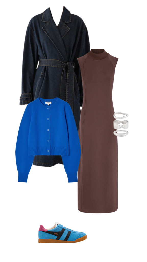
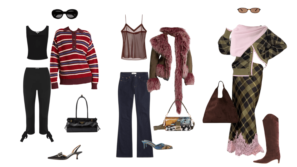
I love a beautiful cobalt blue with shades of brown, too. Actually, I won’t limit myself here. Lighter sky blue and a deeper navy pair amazingly with mocha as well, and I love the idea of styling a brown piece with multiple tones of blue. A dark denim trench, a bright blue cardigan, a pale blue sneaker or boot—all styled around a brown mini skirt or fitted dress. Blue is one of those colors that feels almost neutral—hello, denim—but bold at the same time. It’s the perfect color to use for a multi-tonal look.
Deep red is another major color this year, and I love the way styling it with a neutral shade like mocha mousse can make it feel more casual. It’s such a decadent shade, and sometimes that sentiment overwhelms an outfit, making you feel more dressed up than you wanted to be. A soft neutral like Pantone’s color of the year makes the striking red tone a lot more gentle.
Pairing beautiful colors with a neutral puts the bolder hue center stage, while still making both colors pop.
Prints
There are two ways to make prints happen with mocha mousse.
Firstly, animal prints. Cheetah, leopard, zebra—they pair beautifully with this shade of brown. Built from neutrals themselves, animal prints easily create interest and dimension in an outfit without having to commit to bold colors.
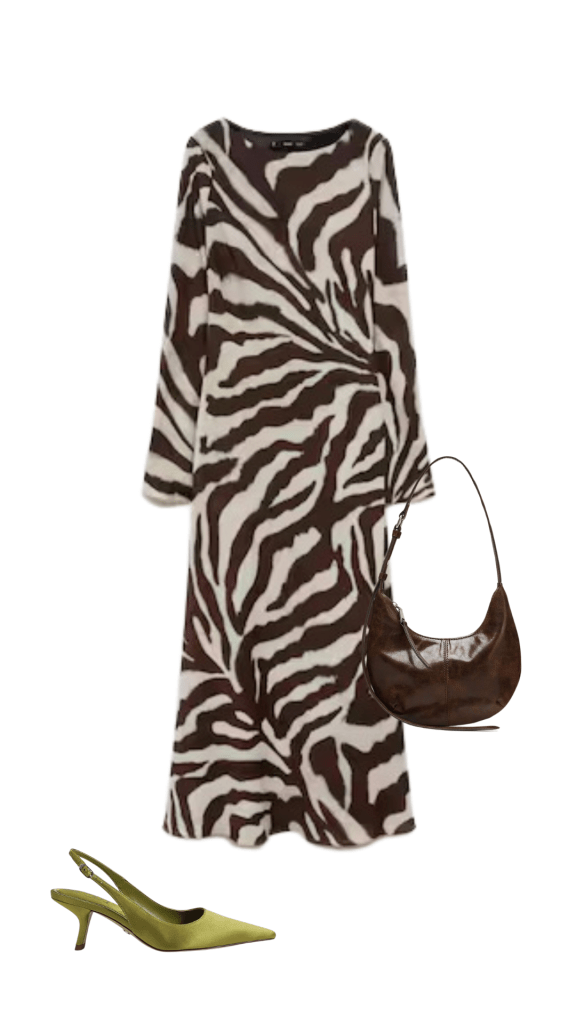
But what I really love is when the print itself incorporates this cool, medium shade of brown. A zebra print with a soft cream and muted brown in place of the classic black and white makes for a gorgeous, easy to style print.
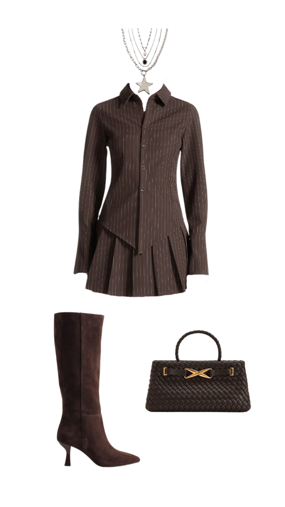
Subtler prints work beautifully with this color, too. I love something straightforward and simple like a pinstripe, especially when the look leans into totally monochromatic styling. A matching printed set with accessories in a similar color looks so chic and cool, without feeling boring.
Structure
My final tip for styling mocha mousse without falling into the boring super-neutral pit is creating a structured, interesting silhouette.

An oversized, boxy shoulder is one of my favorite silhouettes in any shade, but I feel like the shape lends itself especially to beautiful, soft neutrals.
Cinching a boxy blazer with a belt and pairing it with a micro short and tall boot emphasizes the already dramatic proportions—the perfect silhouette, in my opinion.
A boxy jacket paired with a baggy trouser is another play on proportions I love in this hue. A jacket that hits just above the hips, above the waistline of a low rise pant. Effortlessly cool in the masculinity of the shape, but still the kind of look that can feel polished and put together.
So, what have we learned? Mostly, that I have a lot of questions about who designates the color of the year, and what criteria goes into that decision. But also that there’s no such thing as boring clothes or boring colors, only boring styling. And when it comes to Mocha Mousse, the three keys to interesting styling are: good color combos, fun prints, and cool silhouettes. Neutral does not mean dull, and if this is going to be our color of the year, we can choose to see it as an opportunity to really build up our own personal styles.


Leave a comment